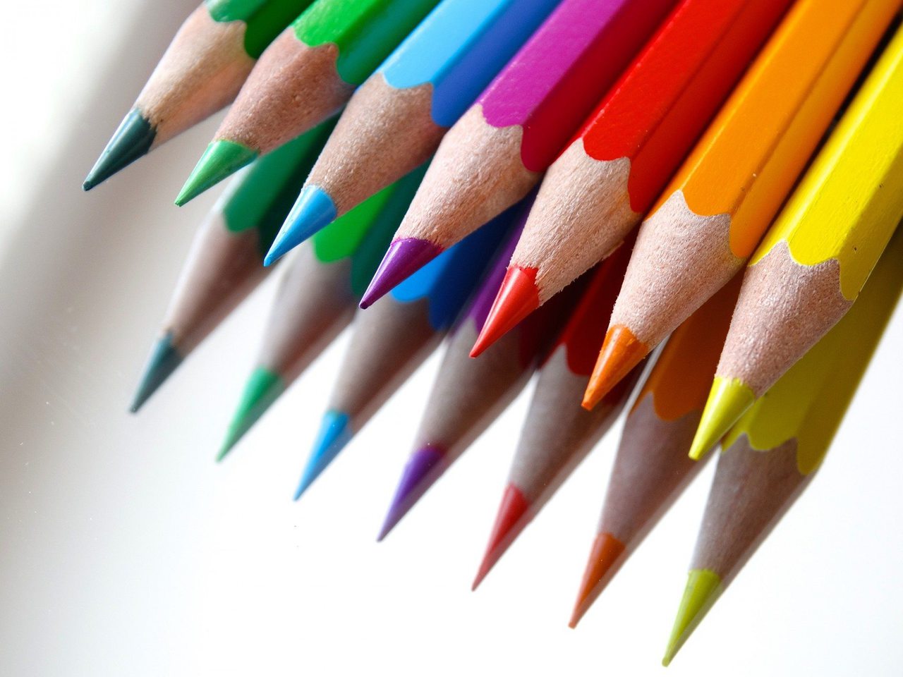
I’m feeling blue. He was green with envy. She went red in the face. Colour is not just around us, it is inside of us. Colours help us decide what to eat, how we feel, how we communicate. It is not just what we buy, colours help us determine the brands that we will buy from. They kind of have their own personalities.
Have you ever dealt with a graphic designer who agonized over finding the exact right shade of blue? That is because finding the right colour is one of the ways we can market to a person’s subconscious. For instance, consciously red means stop, but to your subconscious red can jump up and down and scream GO! But why?
RED
Red is an attention getter, it screams look at me! If a person looks at nothing else on a page they will notice the red. That is why you will find websites and social pages highlighting their call to action in red. Red invokes passion and love. It stirs feelings of danger and creates urgency, there is a reason that sales signs are red. Reds and colours close to it like orange are what you use to attract impulse shoppers. Red does have a caveat though, designer beware. Red is also draining and tiresome. If used too frequently it creates a fatigue, so use red sparingly.
If red was a woman she would be Julia Roberts in Pretty Woman, obviously.
BLUE
If we asked you what colour you would choose for a bank, what would you choose? Probably green, because it is the colour of money – well, American money at least. The optimum colour for banks is actually blue. Psychologically blue gives us the feeling of security and breeds trust. In Calgary there is ATB, BMO and RBC all have predominantly blue logos. Navy blue and teal are the colours to use if you are targeting shoppers on a tight budget. Other words associated with blue? Power, stability and acumen.
If blue was a man he would wear a dark blue power suit with an expensive watch and perfect hair.
GREEN
Green is a pretty straightforward one. It is the colour of health. If you have a business that is geared towards healthy living or healthy food green is the colour you want to use. Think Calgary’s own, Made Foods. People associate green with wealth, health, relaxation and the environment. When stores want their customers to relax and stay longer they use soothing green to do it. It is also the easiest colour for the eye to understand. Using a lot of green on a website can help boost brand retention and recognition.
If green was a person they would be part hippie part yuppie, chaining themselves to trees with really expensive rope.
YELLOW
You’re already thinking about those big golden arches, aren’t you? It’s not just McDonald’s that predominately features the colour yellow. Think Subway, Nikon, Ikea, and Ferrari. Yellow is associated with joy, youth, optimism and confidence. Stores and websites use yellow when trying to reel in shoppers who are just looking. Window shoppers that probably want to spend money but haven’t been persuaded to, will probably part with their green because of the yellow.
If yellow was a person it would be a young girl, straight out of school with her first grown up job.
Edward Bernays, the father of public relations knew the power of colour as far back as the 1920s. He got Lucky Strike to change their packaging from green and red to white and red. It caused their sales to skyrocket. Why? Because women didn’t like the colour green so they weren’t buying Lucky Strike.
Just like finding the perfect colour can help influence sales and design it can also hinder it. Just stay away from grey, light pink, light blue and brown and your design will be just fine.
