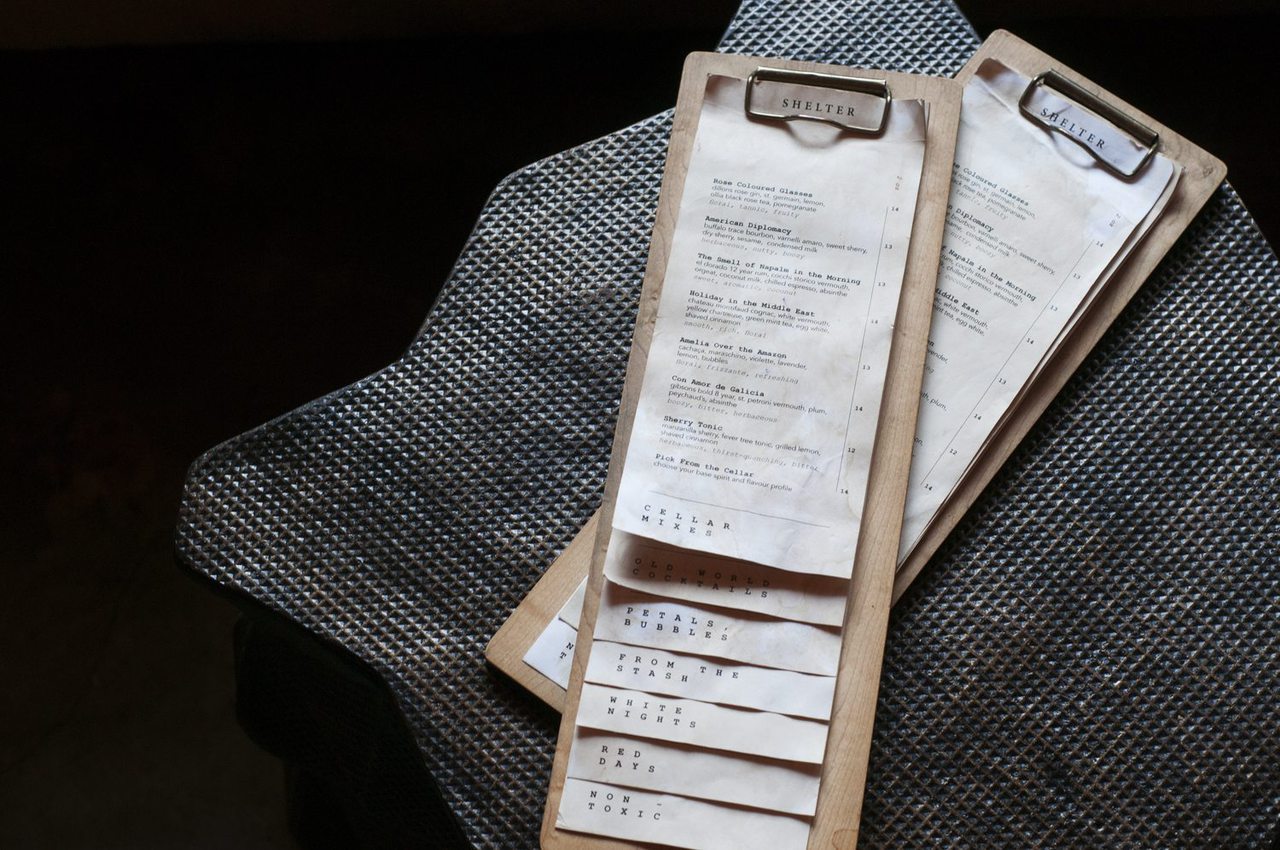
We have been in the graphics industry for long enough, that we have graduated to the honour of being asked to do menu design for restaurants. But there are a ton of restaurants out there that need menus designed, why is it such an honour, you ask? Because, any restaurant, bar, or catering company that is looking to have their menu designed by a professional, is a meticulously planned and thought out establishment.
How many times have you been to a random pub and complained about a poorly laid out menu or spelling mistakes throughout it? The really top-notch restaurant teams know the devil is in the details so they had better have those details right. That’s where we come in. We have designed some truly spectacular menus for some of Calgary’s most talked about restaurants, we have learned a few tips along the way that our lovely design team is happy to share with you.
Brand Story
If there is already a brand in place, you should be following it to the letter, while also creating something good to hold with an intuitive informational hierarchy. Anything you design should be a natural extension of the current brand story.
Mood Boarding
The vision of the business and owners are a natural extension of the brand. Do they plan on having a cocktail-focused business or is it all about fresh, local ingredients and brilliant food? Is the venue spacious or intimate? Will the space be bright and airy or dark and romantic?
The overall ambience of the restaurant will be a determining factor in how the menu is going to be designed.
Size Matters
Not every menu is created equally. Gone are the days when you could create a one-size-fits-all menu that would appease the masses. When you are designing for a high-end restaurant, the sizing is going to be most important. What are the table sizes? You can’t have a large menu on a small table. How is it going to be displayed? On a clipboard, layered on top of each other? All of these details are important to know early on.

Blending Aesthetics
Working with the client can often-times be the biggest challenge for a graphic designer. If you are a minimalist by nature and your client wants big bold colours and competing patterns, you can always work to find common ground.
Building a relationship with a client does take a little bit of time and energy, but it’s worth it.
Our biggest tip to get to know your clients aesthetic is to ask them to peruse the interwebs and find a few samples of menus that they really like and a few that they don’t like at all and get them to explain their reasoning. It will get you started on the right foot with each other.
With few exceptions, solid menu design comes down to trial and error. Usually, there will be multiple iterations before you and the client decide on a style and layout that will complement the space and bring the brand together. Of course, if you are looking to have a menu designed for your establishment, we would love to chat! Give us a call and see how we can help!
