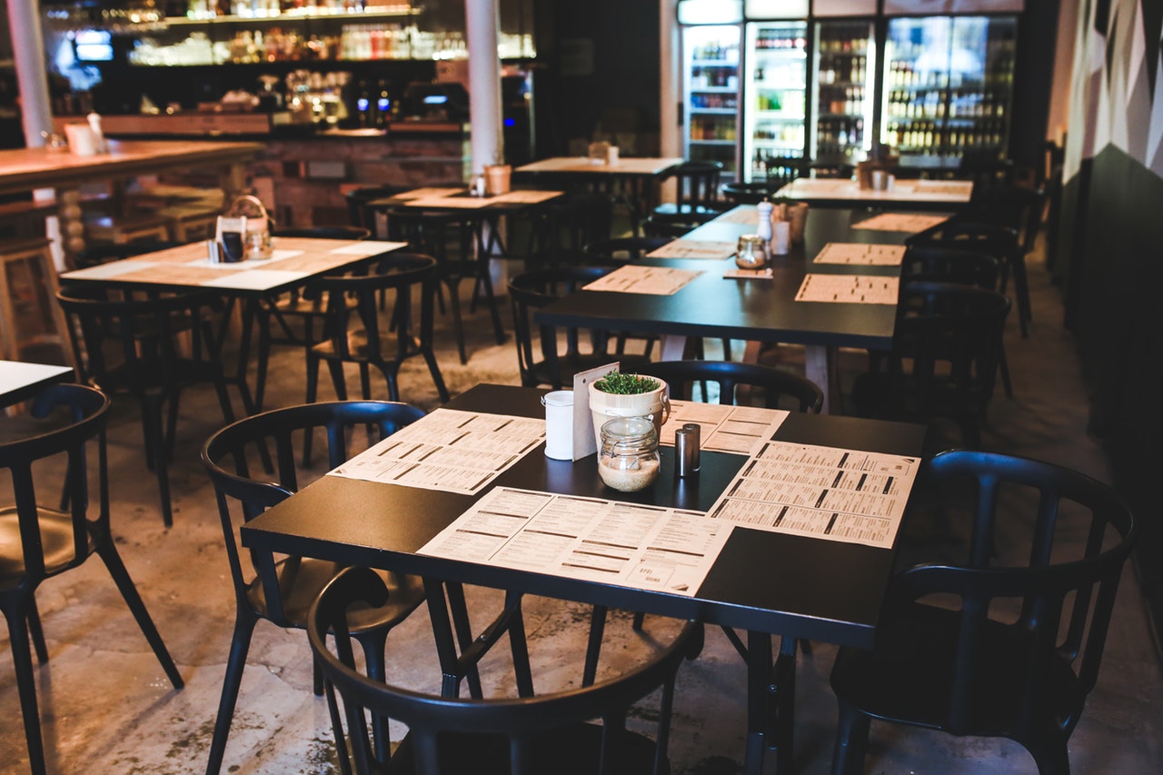
Our creative agency has been in the business of graphic design for a minute or two now and we have gotten to a really fun place where some of the hottest bars and restaurants come to us to create unique and “on brand” menus. It is a really cool experience, being able to design the most looked at marketing material in a fresh local joint.
How many times have you been to your neighbourhood bar and thought how bland their menus are and how many spelling mistakes are running through the whole thing? (Or is that just us?) Overall, the best restaurant groups know that the details matter and they are looking to have those pieces all work together beautifully. Those kinds of layouts are where we shine!
Our graphic design team has created really special menus for the most talked about local establishments, which means we have learned some pretty cool tricks of the trade along the way and we thought we’d share them with you.
Storytelling
If there is already a brand or a brand guideline in place, you should be following it right down to the fibres, while also creating something nice to hold with a really easy flow. As any good designer knows, the menu you create should be an extension of the brand story.
Common Threads
The owner’s vision is the brand. That is where you probably want to start. Is the plan for the company to be all about the drinks? Craft beers? Wine bar? Or is it all about locally sourced ingredients and food first? Is the room big or small? What is the air of the restaurant, light or dark? Clearly, the overall feel of the restaurant will be a determining factor in how the menu is going to be designed.

No More Massive Menus
Not every menu is created equally. Stop making GIANT menus with a million features. This isn’t advice just for you, but your client too. Gone are the days when you could create a one-size-fits-all design for all of the peoples. There are a ton of elements to think of when it comes to the actual size of the menu itself. How big are the tables? How are the patrons going to look at it? Will it be on a clipboard or in a folder? Good things to know.
Blended Visions
Working with the client can often-times be the biggest challenge for a graphic designer. If you are a minimalist by nature and your client wants vibrant colors and a variety of patterns, you can always work to find common ground.
Building a relationship with a client does take a little bit of time and energy, the more you get to know your client, the easier it is.
Want our best advice to get to know your client’s aesthetic? Ask them to look over the internet, scope out the competition, and find a few samples of menus that they really like. Even better? Get them to find a few that they really hate and explain why. It’ll help you learn each other’s style right off the bat.
Need to have a menu designed for your restaurant? We are always happy to talk about it. Shoot us an email, give us a call or send us a smoke signal to see how we can help!
