Ever wonder how a logo grows from a sketch to a tangible and real object? It all starts with an idea — a concept, something small that eventually is turned into the headpiece for an entire brand. While we can’t cover all angles of development in a simple blog post, suffice it say that creating a truly effective, memorable and simple logo is not the easiest and cleanest process.
In the example here, our team went through over 20 concepts with over 150 revisions to nail down the final end product for premium crystal manufacturer and designer; Cristaux International. Through an almost painful process of extracting the unnecessary and integrating a company mission statement into a design, we finally arrived at a fully fledged corporate icon that will stand for the Cristaux brand into the next decade.
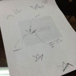
It starts with a sketch and grows into more. The idea here was to implement past, present and future, highlighting the progression of growth, the history of glass and the future development of the company.
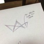
One of the many notes and observations during the construction phase of the logo. Remarks, comments, thoughts — all constantly rethought, remodelled, reimagined to draw out the true idea into life.
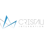
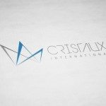
The logo is taken from a paper sketch and drawn with careful focus using creative technology. The finer pieces including typeface, shadowing and depth are all carefully added on to take the idea from flat to multi-dimensional.
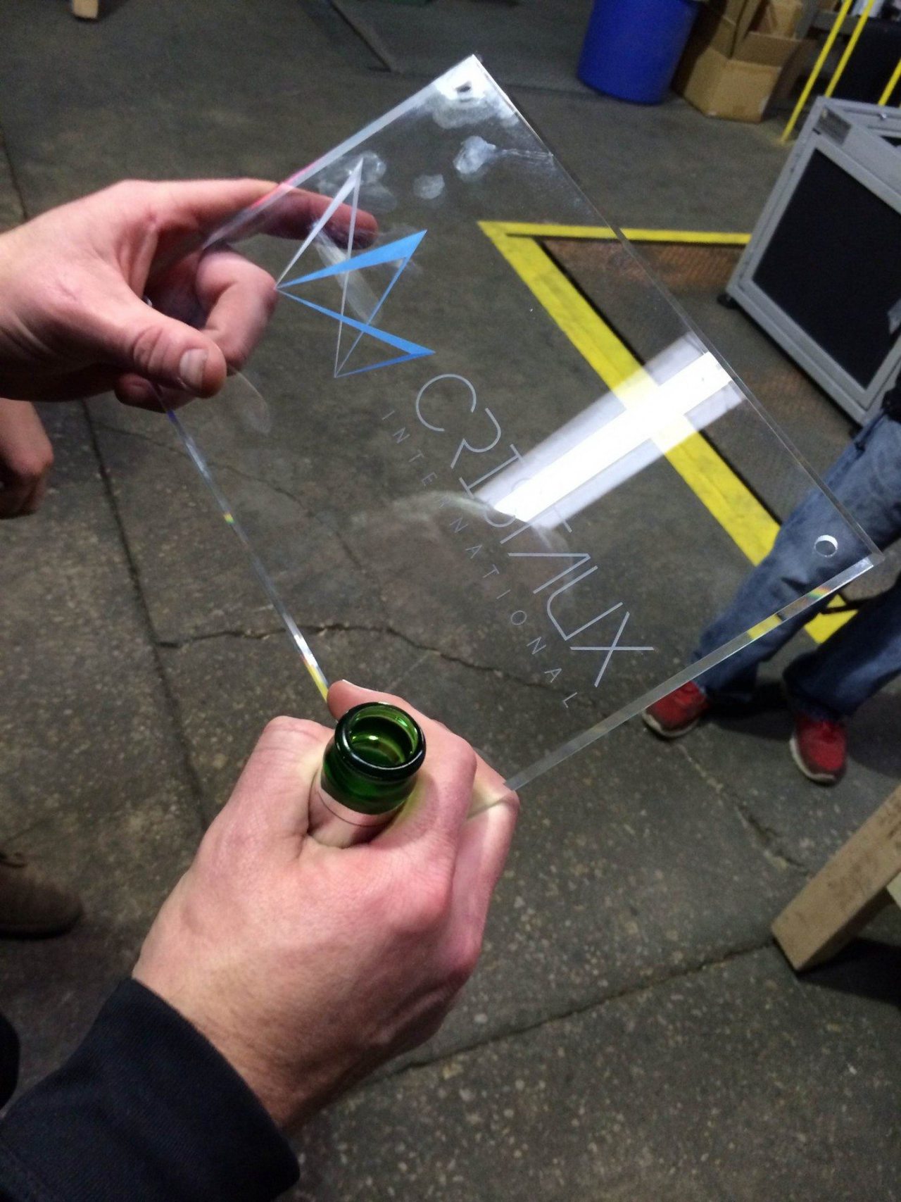
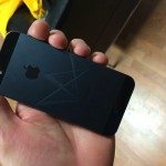
The brand finally reaches it’s end point; a glass manufactures test the final logo iteration on a piece of glass itself. The process of agile development literally being tested before our very eyes.
The entire project was exciting to work on! We have the auxiliary stationary, cards and other branding pieces coming soon; keep your eyes peeled and looking at our design portfolio to see the final iteration and branding package that’s on the way!
