Being on top of the game in marketing is definitely one of the most important thinks for businesses but how do you know what is the most effective these days? What is the most effective medium to promote your company and keep the sales going? We are going to talk about the differences and evolution of print marketing and digital marketing to see what is more effective. Is print marketing even relevant anymore with all the digital platforms going on? Of course it looks like you’ll be silly to invest in flyers and print media since in this day in age its all about the email and social media marketing right? Well a closer look shows us that it hasn’t really become irrelevant yet. Print marketing still has potential in the area of promotion, something that digital marketing just hasn’t caught up to yet. Physical pieces of marketing are more […]
Email Marketing
In case you were wondering… email marketing is one of the leading platforms for digital marketing. It’s expected that by the end of this year the total number of worldwide email accounts will be over 4.3 billion. Amazing right? Why is this you ask? – it’s effective and convenient. We are now living in a time where digital devices and communication have become more and more widely used and marketing tactics have used this to their benefit. As a tool, email marketing can be more successful at acquiring new clients than Facebook, Twitter, Instagram, and the like. This is because we are so used to and accustomed to filtering out advertisements when we surf our social media. A well-designed email doesn’t seem spammy or just another advertisement. If you can capture the attention of the reader and avoid being deleted, then you’ve got them on the boat. The key to […]
Colour in Design
Hello first blog post of 2016! We here at talonX design would like to wish you a very happy and successful new year! With 2015 behind us, we are excited and looking forward to see what 2016 has in store for us. Today’s topic will be discussing the importance and effects of colour in design. So why is colour important in design and why should we carefully consider the shade tone and vibrancy of a colour before we choose one? We all know how easy it is to simply choose your favourite colour and move on with the design. But your favourite colour may not compliment the rest of the design. Here are some things to think about when you’re next face with the difficult colour decision. Colour has emotional resonance – this means that when we see a certain colour we have a certain response towards that colour. Be […]
2016 Design Trends
It’s nearing the end of the year, 2015 has gone by fast and so has the changes in design trends. Now its time to take a look at what we think will be the next up and coming trends of 2016! In 2015 we saw some of these trends take shape and we expect them to continue into the New Year. Flat Designs and Geometric Shapes Flat designs have been trending for a few years now. Ever since the launch of this simple and clean design, it’s no doubt that it’s a favorite among designers. The simplicity and elegant use of colour in the flat designs help to convey a certain honesty and visual harmony in design. Less is really more in this case and it’s no wonder that this design will probably gain more exposure and variability in the upcoming year. Along with flat designs usually comes with geometric […]
Creating An Effective Icon
What makes a good icon? It should be something that is memorable as well as simple. It should also be something that compliments the exiting theme of where this icon will be used. Whether its an app or website, the app should be carefully designed to fit into these themes. An icon is basically a visual metaphor for a subject or item. Here are some steps to take when designing an icon. Research and define keywords that will define your icons. Find symbols or images that will associate with the concept you are communicating. Objects can be depicted in their original manner and activities or actions can be eluded with related objects. Shapes and abstract symbols can help with more complex concepts. When the subject of the icon is defined, graphics can then be drafted. Different variations of the icon should be made and put side by side to compare […]
Videos are the Future of Content Marketing
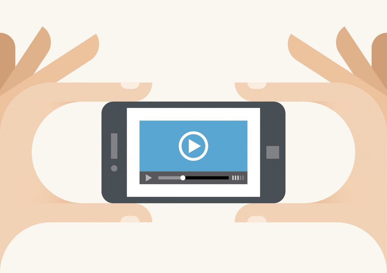
It’s easy to see that online videos have worked its way into being the top most effective method of marketing. As long and short videos populate the interwebs, the potential reach from videos is increasing and that makes it an ideal platform to market on. Not only is the audience vast but also the content is attractive. It’s no doubt that video marketing is the future of content marketing. Videos engage viewers and encourage them to spend time on your website interacting with the brand. They are naturally appealing and present content seamlessly. Just as a painting can paint a thousand words, a minute of video is worth much more in addition to the impression it leaves. Over the recent years the production cost of videos has decreased and the amount of affordable equipment has allowed small businesses to delve into video marketing. Just as any other method of marketing, […]
2015 Design Trends
2015 has been a year of interesting changes and progressions in graphic design and website design. Here are some trends that we have picked up on: 1) One of the biggest trends going around is to have an interesting image as a background for the website page. With the variety of stock photos and amazing photography available nowadays, there’s bound to be a perfect fit. These images convey the tone and give a first impression for the website. Usually this is paired with a typeface and unobtrusive graphics to match. The photo is really the main focus and attraction piece for setting the reader in a certain mood and mindset for the rest of the site. 2) Just like how a photo can convey messages, a video can too. Now we are seeing many front pages with beautiful videos of what a company does. The key is to let the […]