When it comes to branding, logos make the world go round. After the foundation of a business has been laid and the wheels of practice start turning, the cardinal aspect of any business is a logo that can help elevate stance.
Naturally, logo design has evolved over the years to cater to our growing artistic sensibilities and also for a little healthy competition when vying for attention. With everything so readily available online and being surrounded by a plethora of options on a daily basis, a good impression is key and since we’re always on the lookout for the next new thing in design, here are some logo designs that are having their moment now.
Low Polygonal Design
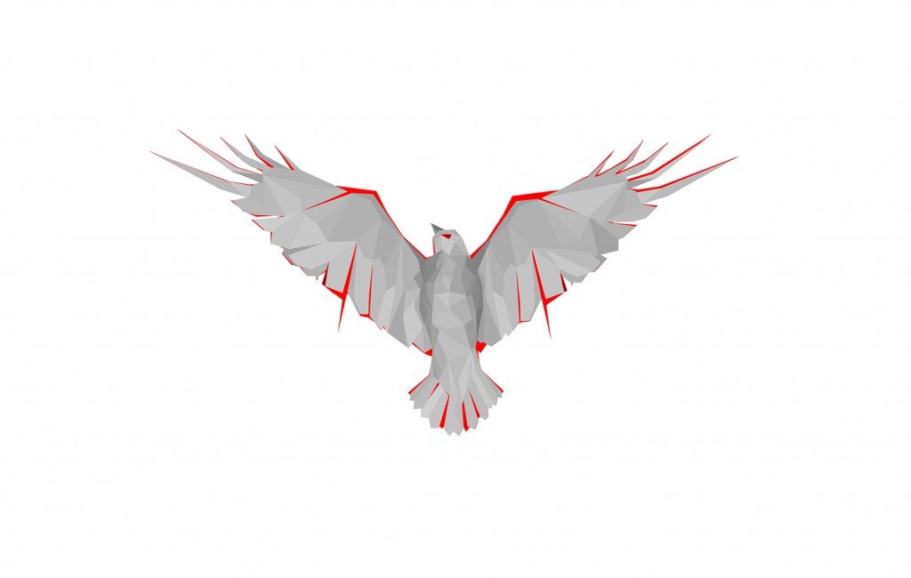
Something about polygons just gets us excited and maybe it’s because in our high-def world it’s nice to have something that retains a little abstraction. By reducing graphics into their geometric counterparts, polygonal design can be either complex or basic depending on the number of shapes, textures and colors used. As a result, it creates a sort of 3D graphic both intriguing and easy on the eyes. We’ve even dabbled in it ourselves.
Line Craft
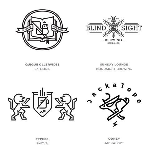
Innovation is the real gist of creation. With so many talented designers creating new work and exploring the different genres of design sometimes you discover that less is more. Enter line craft, a single stroke weight influenced by icon design. Simplistic and clean, with just enough line to define shape but not enough to lay in tonality; line craft is a bit like stripping away the heavy flesh to expose a really striking bone structure.
Negative Space
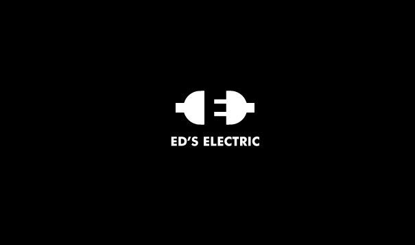
Clever use of negative space is a force to be reckoned with in logo design. Sometimes acting as optical illusions, it can add a layer of subtlety and complexity to otherwise iconic logo designs. Negative space is basically the area that encapsulates a logo to give us understanding of a “positive” image that is the logo itself. The best use of negative space in logo design is something that may not be noticeable at first glance, but once it is, becomes an intrinsic part of the design. A good example of this is in the FedEx logo, which has an arrow hidden between the E and X, and upon discovery is equivalent to the awe of Christmas morning. Not only that, it furthers the message behind the company of FedEx itself as a shipping company that stakes its reputation on being direct and straightforward. Another great example of negative space done right is in the Ed’s Electric logo below.
Modern Vintage
Our modern world is undeniably complex. With this mind, designers are retreating back to the good ole’ days for inspiration. Something about vintage style logos resonates with people in special ways. They suggest a certain quality and “value” that will stand the test of time with designs that transcend style, taste and age. Incorporating hand lettering, badges and graphics reminiscent of the industrial revolution, rustic retreats and sailing adventures, the use of vintage graphics is arguably one of the biggest trends to hit logo design in recent years.
